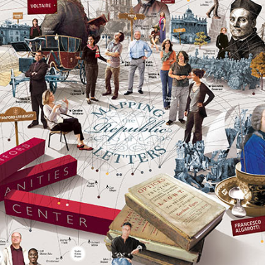
Mapping the Republic of Letters
The product of a collaborative research initiative led by Stanford University, Mapping the Republic of Letters seeks to uncover and further examine the networks of knowledge/correspondence that were utilised by the world of scholarship. By studying the sources left behind by these networks (e.g. letters, journals, publications etc.), the project teams have produced a number of datasets and visualisations that help to answer questions about how people, knowledge, and even objects were circulated and disseminated during this time. The main content of the site is spread across two areas: Case Studies and Publications. In exploring the former, site users will be able to access overviews of each study that's currently being conducted. While some of these have less information than others, most write-ups are fairly detailed and come with examples of how primary source data is being utilised. The project on visualising Benjamin Franklin's Correspondence, for instance, provides a few explanatory paragraphs detailing the project's scope, goals, and methods before giving examples of how data visualisations have helped to answer certain research questions. Inputting information from Franklin’s correspondence between 1757 to 1763, the project team have managed to identify which geographical areas his letters mainly came from, when, and from whom, amongst other associated details. This in turn has helped them to reconsider definitions of cosmopolitanism during this time and examine how the flow of correspondence relates to relationships between centres and peripheries. Overall, there are currently 12 case studies to explore, these stretching from Galileo to Voltaire, and the Grand Tour to the Spanish Empire. While the Case Studies can be likened to samplers, the Publications section of the website delves further into projects that have already been completed. Here, site users are invited to not only read the publications that have resulted from each project, but also explore interactive visualisations of the data that was used and download the actual data sets. Correspondingly, most Project pages provide a brief overview of the project itself and a series of external links to publications, interactive visualisations, data, and its associated schema. Most casual users will likely make use of the publications(s) and interactive visualisations links, though some researchers might also be interested in downloading and viewing the actual raw data. Looking at the site more broadly, it’s worth mentioning that some of the Case Studies seem to not have been updated in a few years. This is less apparent in the Publications section, though the most recent update seems to have been from 2018 – not exactly recent at time of writing. Navigating the site is mostly simple due to its largely minimalistic nature but users on a laptop might struggle with some sections loading on the first go, if only due to the amount of data that’s being presented. Some users might also find the light coloured font slightly difficult to read, especially since much of it is against an equally light background. In terms of classroom useability, this site is generally recommended for slightly older students. Despite the data visualisations being extremely informative, they can also unfortunately be quite unwieldly and complicated to use. Rather than have students explore the visualisations themselves, teachers can instead consider using these as examples for how advances in technology are changing the ways in which researchers interact with primary sources. Students can then be invited to consider what other new methods might be used by researchers as well as they potential shortcomings. Alternatively, teachers can also consider using the case studies as a means to draw attention to how networks of exchange function. Students can then work on their own networks by finding ways to ‘link’ one major historical figure with another, be it via written correspondence, a shared social connection, or an overlap in areas of interest. By publicising these datasets and methods, the project teams behind Mapping the Republic of Letters offers users an interesting peek behind the curtain of research, so to speak. Browsing the site, users are able to gain a deeper appreciation for how data visualisation can help academics examine previously well-known and well-utilised primary sources in new, innovative ways.
How to Cite This Source
"Mapping the Republic of Letters," in in World History Commons, https://worldhistorycommons.org/mapping-republic-letters [accessed April 18, 2024]